I love colour! Yes its true; as long as those colours are Black, White or Grey! Black makes me feel protected, safe and strong; White makes me feel fresh and creative while Grey makes me feel calm.
The perfect combo, however its good to add a few touches of other colours, and when your background is a neutral combination such as mine you can add whatever colours you like, and change those colours whenever you like.
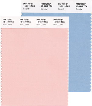
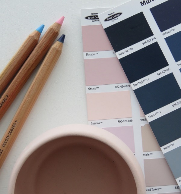
Pantone has release their colours for 2016 and they are Rose Quartz and Serenity, a soft warm pink and a cool pastel blue; colours that are said to bring compassion and the equality of gender. Perhaps a little old fashioned but they do evoke feelings of tranquillity and for that they get a big tick from me.
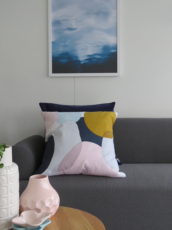
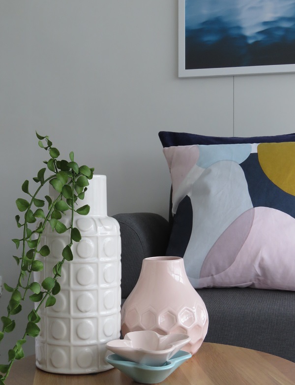
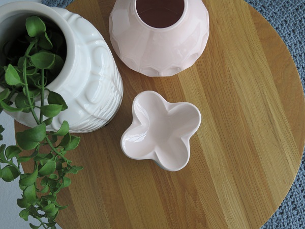
Heres a quick colour transformation using them as accents to the grey and white background in my office studio…
The cushions are from Fine Little Day and Citta Design, print is from Olive et Oriel, and the gorgeous wee fluted bowls are from Rachel Carley Ceramics, and the larger vessels from Kmart and Freedom.
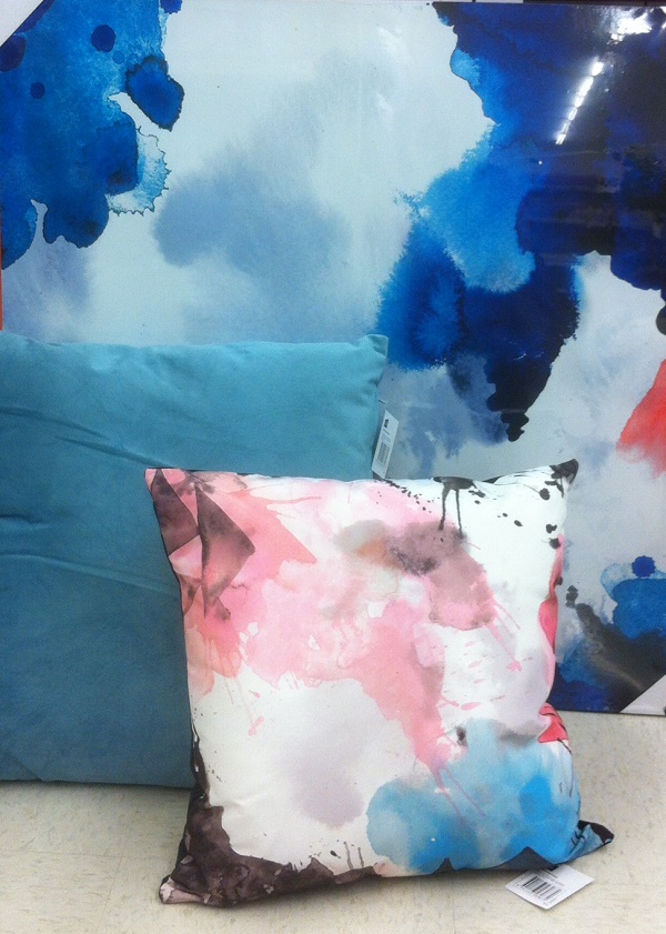
Take a look at this alternative from Kmart; I put together this cushion and print combo in store; total value under $50. Its a little bolder and the quality is not as high but it works.
And when you have had enough its simple to swap it out for something different.
Read more about Pink and Blue and check out Resene Cavern Pink and Rock Blue
Photography and Styling by My Little House





0 comments: